Brand Guidelines
The essential guide for video editors. Start with the non-negotiables, then jump straight to your platform.
00. Start Here
New to the playbook? Read this first — then jump straight to what you're making.
The Non-Negotiables
These apply to every asset, on every platform, no exceptions. Everything else in this guide is detail — these are the rules that get a cut rejected.
Our Social Tenets
The non-negotiables cover how a cut is built. These cover how it sounds — the voice behind every post, on every platform.
🚩 Red Flags
- We are not snarky
- We are not provocative
- We do not post suggestive content
- We are not hypocritical
- We are not monotonous
🟩 Green Flags
- We are always warm with our intentions — cheerleaders of your favourites and their sentiments.
- We are enablers of memorable, groundbreaking moments in social culture.
- We have a light-hearted, humorous perspective on topical and evergreen events.
- We understand people have different tastes, and walk a neutral path rather than being unnecessarily critical.
- We always respect the subjectivity of art.
- We are blue-heart coded 💙
What are you making?
Each playbook carries the full spec for its platform — format, attribution, logo placement and end slates.
👀 Get the Vibe
Before your first cut, absorb the house style from what's already live.
🙋 Approvals & Requests
Contact TRB for permissions, missing assets, exceptions, or anything this guide doesn't answer.
Foundations
The toolkit — colors, type and logos. Reference material: look it up when you need it.
01. Our Colors
Click any color to copy its Hex code.
Primary
Prime Blue
#0578FF
Black
#000000
White
#FFFFFF
Off-White
#F5F3EF
Black and White are the neutrals — for the logo, backgrounds and typography. Note that Black is a special-use colour for AV and in-app applications only.
Secondary (Social Editorials)
The 2026 playbook palette. Colours outside this set are retired — don't reuse older swatches.
⚠️ Secondary colours are exclusive to social media editorials. They are not brand colours and are never used on Watch Now, Official Trailers or Official Teasers — those stay on the primary palette.
Neon Blue
#0000FF
Soft Aqua
#A7DDE3
Grass
#78D056
Shade Pink
#FF60A7
Canary
#FFEF00
Royal Blue
#3937F4
Lime
#DFFFA1
Acid
#D8FF00
Blush
#FFC8D4
Coral
#FD6E5B
Vanilla
#FDF2DE
Lilac
#EAD9FF
Colour Misuse — Never Do These
- ❌ Text in anything other than White or Black on a Prime Blue background
- ❌ Black for headline text on Prime Blue
- ❌ Text colours that fail accessibility contrast
- ❌ Prime Blue text under 18pt regular — or under 14pt bold — on white
- ❌ Any colour outside the approved palette
- ❌ Products on a colour with less than 1.2:1 contrast
02. Typography
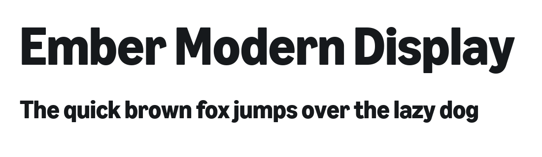
Primary: Ember Modern Display
Our primary typeface. Clean, coherent, and distinctly Amazon.
Download Ember Modern DisplaySecondary Fonts
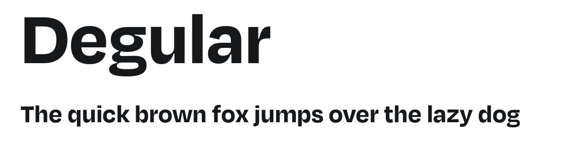
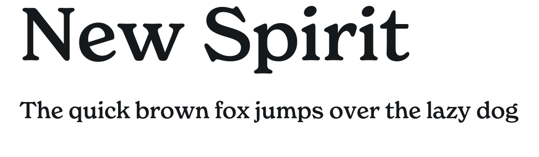
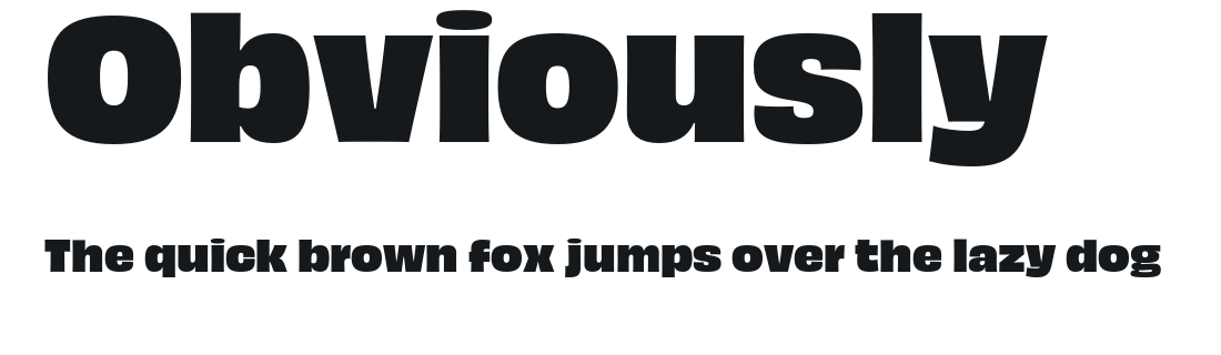
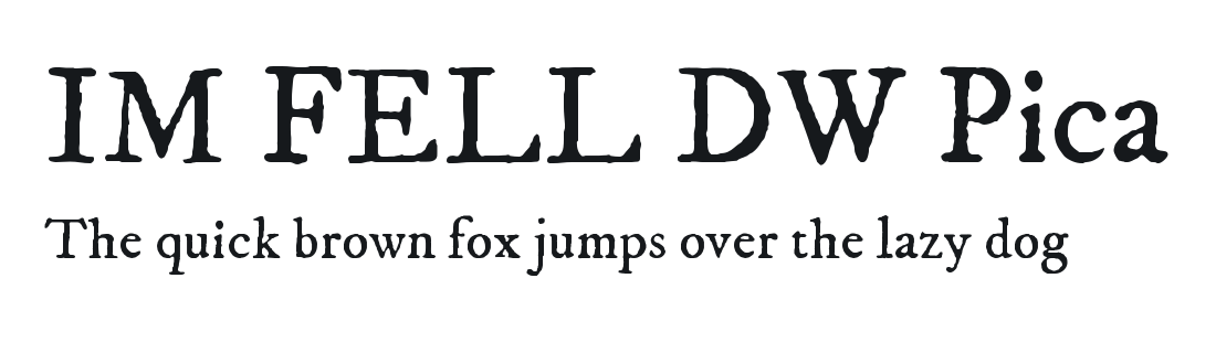
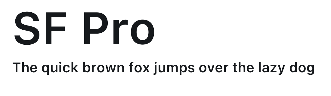
Six additional faces — SF Pro, Upright, Degular, New Spirit, IM FELL DW Pica and Obviously. Each one is set in itself, with its usecase, in Font Specimens below.
⚠️ Like the secondary colours, these are editorial-only — never on Watch Now, Official Trailers or Official Teasers.
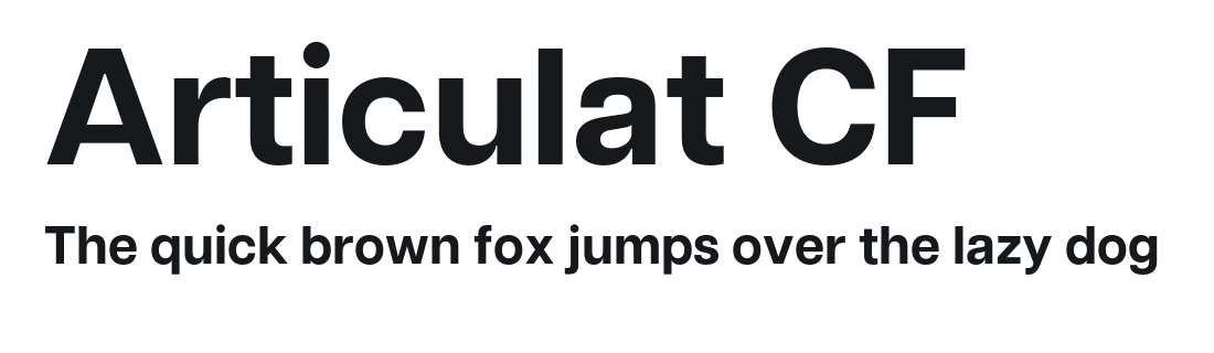
See the SpecimensAttribution: Articulat CF
The typeface used in every attribution & end-slate PSD. Required for the platform playbook templates to render correctly.
Have an Adobe subscription? Activate it via Adobe Fonts. Otherwise grab the file from the Drive folder.
Activate on Adobe FontsFont Specimens
Every approved face, set in itself. Ember Modern Display is the default; everything below it is editorial-only — never on Watch Now, Official Trailers or Official Teasers. Title fonts are chosen to suit the design language of the title, so pick from here rather than from your own library.

Type Rules
- • Title fonts: selected in accordance with the design language of each respective title.
- • Readability: prioritise dark overlays or gradients behind text.
- • Avoid strokes and drop shadows — unless the creative is a meme. This is a rule for editorial and title type. Subtitles are the exception — they carry a specified stroke and shadow, see 04.
- • Never right-align. Type is left-aligned (preferred for type-driven layouts) or centre-aligned where the layout suits it.
Typesetting Specs
Ember Modern Display is designed around these values. Set them once and leave them alone — they are the default in every Adobe app.
- CaseSentence case. Never all-caps, never all-lowercase.
- KerningOptical. Never metric, never kerned by hand.
- Tracking+1% for Bold and Regular alike. Tighter is hard to read; looser loses legibility.
- Leading90% — the same size as the font in use, at any scale. Go to 100% on lines where ascenders and descenders make 90% feel tight.
- Headline weightEmber Modern Display Bold; subheads in Regular.
- Subhead size0.3× to 0.7× the headline size, depending on layout.
Accessibility: 1.5 line spacing is recommended for body copy. Margins should feel comfortable — never tight to the edge, never so wide the layout floats.
03. Logo & Bugs
Two distinct bugs, depending on what you're promoting. Where the logo sits on each platform lives in the Platform Playbooks.
Hygiene Bug (SVOD)
The horizontal prime video wordmark with the smile. Used for standard SVOD titles.
Hub Bug (Rent & Subscriptions)
The rounded-square app icon with the stacked wordmark. Used for Rent & Subscriptions / editorial hub content.
Prime Original Logo
The prime original lockup — used only on Prime Original titles. Same colour rules, clear space and misuse list as the Prime Video logo; never mix the two lockups in one frame.

YouTube Logo Placement Overlays
Full-frame transparent PNGs with the White logo already in position, top-right. Drop one on the top layer at 100% scale — do not move, resize or recolour it — and the bug lands where it should. Hold it for the video, and take it off before the end slate. These cover the top-right placement — the cuts that sit the logo elsewhere are listed in 08. YT Shorts and 09. YT Long Format.



Measured off the overlays, if you are rebuilding the position by hand: 16:9 — lockup 215 px wide, 72 px in from the right edge, 60 px down from the top. 9:16 — lockup 191 px wide, 142 px in from the right, 222 px down (237 px on the double-line version).
Clear Space
The logo needs room to breathe. Measure it in x, where x = the height of the ‘n’ letterform in the lockup.
- • Keep at least x clear on every side, and 1.5x beneath.
- • That's the minimum, for the smallest and tightest placements — not a target.
- • Clear space scales with the lockup: bigger logo, bigger gap.
Misuse — Never Do These
Do not alter the artwork, proportion, or colour of the logo.
- ❌ Outline the logo
- ❌ Remove elements from the logo
- ❌ Rotate the logo
- ❌ Distort or stretch the logo
- ❌ Add effects such as drop shadow
- ❌ Modify or recreate the logo
- ❌ Change the proportions
- ❌ Move the location of the smile
- ❌ Set the logo in un-approved colours
- ❌ Use a registered trademark symbol
- ❌ Place over a busy or complex photo
- ❌ Place over a low-contrast background
- ❌ Add a shape or extra elements
Craft
Rules that apply to every edit, on every platform.
04. Subtitles & Safe Zones
Specs
Refer to these settings for exact values.
Note: These rules apply to standard subtitles only. Stylized/creative subtitles have more flexibility — see References & Examples for shipped cuts showing exactly how far that stretches, and what holds regardless.
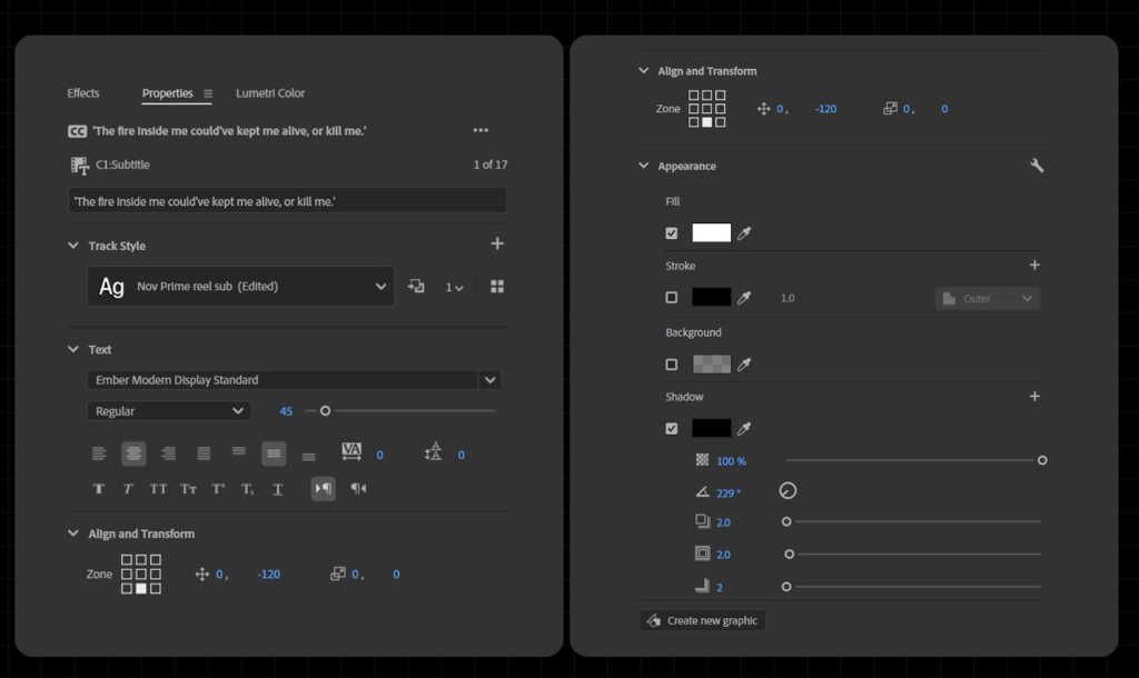
The Premiere setup for Reels and Shorts alike. The “avoid strokes and drop shadows” type rule does not apply to subtitles; they carry a specified stroke and shadow.
⚠️ This screenshot is out of date — it shows Stroke unticked and the shadow at 229°. Go by the values in the table below: Stroke on at 1.0, shadow at 225°.
Quick Start
Don't manually configure every time.
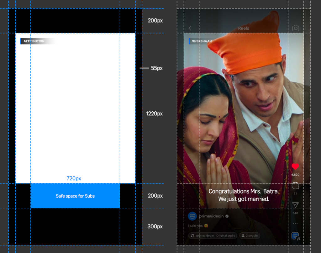
Visual Placement Guide
Drag and drop into Premiere Pro Text Styles panel.
The Settings
One spec for every 9:16 cut — Instagram Reels and YouTube Shorts use the same values. Load the preset rather than typing these in.
| Setting | Value |
|---|---|
| Font | Ember Modern Display Standard (Regular), white |
| Size | 45 |
| Stroke | 1.0, #000000 |
| Shadow | 2.0 at 225°, #000000 |
| Behind the text | Gradient at 10–30% — file below |
Building a static? The panel and 16:9 settings are different — they're on the statics page.
Subtitle Gradient — For Bright Backgrounds
White subtitles disappear over a bright frame — sky, snow, a white wall, a daylight exterior. Drop this gradient on a layer above the footage and below the subtitles, pinned to the bottom of the frame, and the text reads again without dimming the whole shot.
✗ Without

✓ With the gradient
Demo frames — the gradient shown is the actual 9:16 file at full strength.
How to use it
- • Only when you need it. A dark or busy-dark frame doesn't get one — the stroke and shadow already hold the text.
- • Layer order: footage → gradient → subtitles. Never above the subtitles.
- • Full frame width, aligned to the bottom edge. Don't float it or crop it in.
- • Strength: the 10–30% band in the settings table above — enough to hold the text, not so much that it reads as a black bar.
- • Use the file that matches your ratio — don't stretch the 9:16 one to fit a 4:5 cut.
9:16 covers Reels and Shorts. The 4:5 is the same gradient squeezed on the Y axis, so the ramp keeps its proportions in the shorter frame — use it for the 4:5 cut on IG, FB and X.
Subtitle Writing Rules
Subtitle what is actually being said, as it is said. A long subtitle runs ahead of the audio and gives the line away — punchlines, twists and reveals should land on the voice, never on the text.
Line Breaks & Punctuation
- • Prefer One Line: Keep a subtitle on a single line wherever it fits. Two lines are the rare exception — only when the speaker is going fast enough that one line can't keep up.
- • Break Points: When you do break, break before prepositions (of, on, for), articles (a, an, the) and short words.
- • After Commas: Always break after a comma — and after mid-sentence punctuation generally — never before.
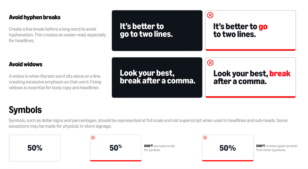
- • No Hyphens: Break before a long word rather than hyphenating across lines.
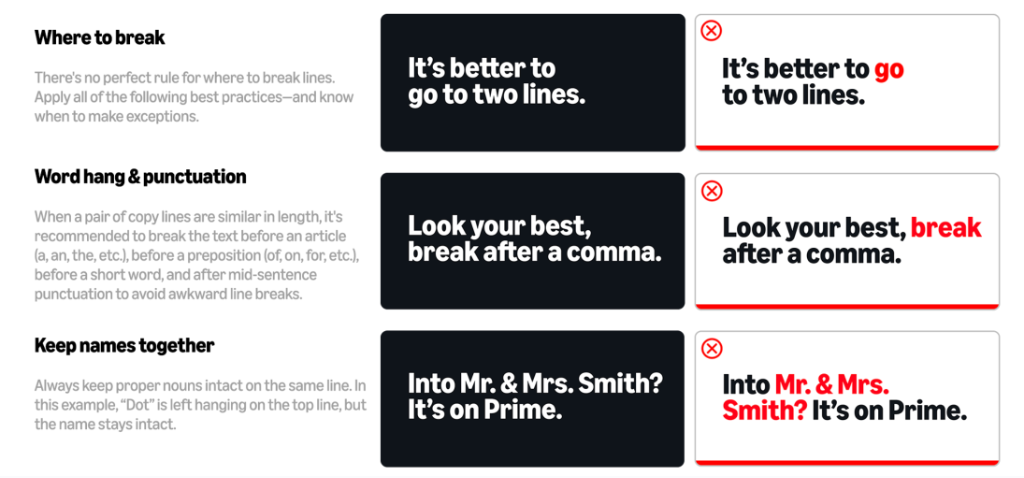
These examples show where to break once a line is too long — not a preference for two lines over one.
Formatting & Style
- • Casing: Use lowercase by default. ("and then Rahul left") Video subtitles only — statics run sentence case, see Statics 03.
- • Exceptions: Capitalize only Proper Nouns (People, Characters, Places) and the letter "I". A name always keeps its capital: "Rahul", never "rahul".
- • No Widows: Never leave a single word alone on a line. Balance it out.
- • Names Together: Keep names intact (e.g., "Mr. & Mrs. Smith" on one line).
- • Symbols: Use full-scale symbols (50%), DO NOT use superscript (50%) and never mix glyphs from another typeface.
The Subtitling Bible
Twelve rules for what the subtitle actually says — the settings above only cover how it looks.
- AccuracyTranscribe the dialogue faithfully. Keep stutters and repetitions when they add meaning.
- BrevityFewest words that carry the message.
- Two-line maximumNever exceed it — convert to more panels instead.
- Strategic splittingBreak at natural pauses and clauses, never mid-word. Aim for balanced line lengths.
- PunctuationCommas and periods do the job. Don't overuse exclamation points.
- InterruptionsAn em dash (—) marks an abrupt cut-off.
- Dramatic pausesEllipses (…) or timing — let the beat land.
- Songs & musicSubtitle lyrics when they're plot-relevant — separate line, italics, marked “(singing)”.
- Speaker IDsOnly when it's unclear who's talking. In brackets, e.g. [Pradhan Ji].
- HyphenationSparingly, and only to keep line lengths balanced.
- Cultural sensitivityWrite for pan-India audiences — mind reading patterns and preferences.
- Visual balanceNever park a subtitle over an important visual element.
Safe Zones — Avoid the Interface
Ensure subtitles and logos strictly adhere to the blue safe zones to avoid being covered by UI elements. Red is the interface — buttons, handles, captions, the action rail. Anything you put there gets covered. The blue band is where subtitles live.
Two overlays, one per ratio. Drop the one that matches your cut on the top layer, park everything outside the red, then switch it off before you export.
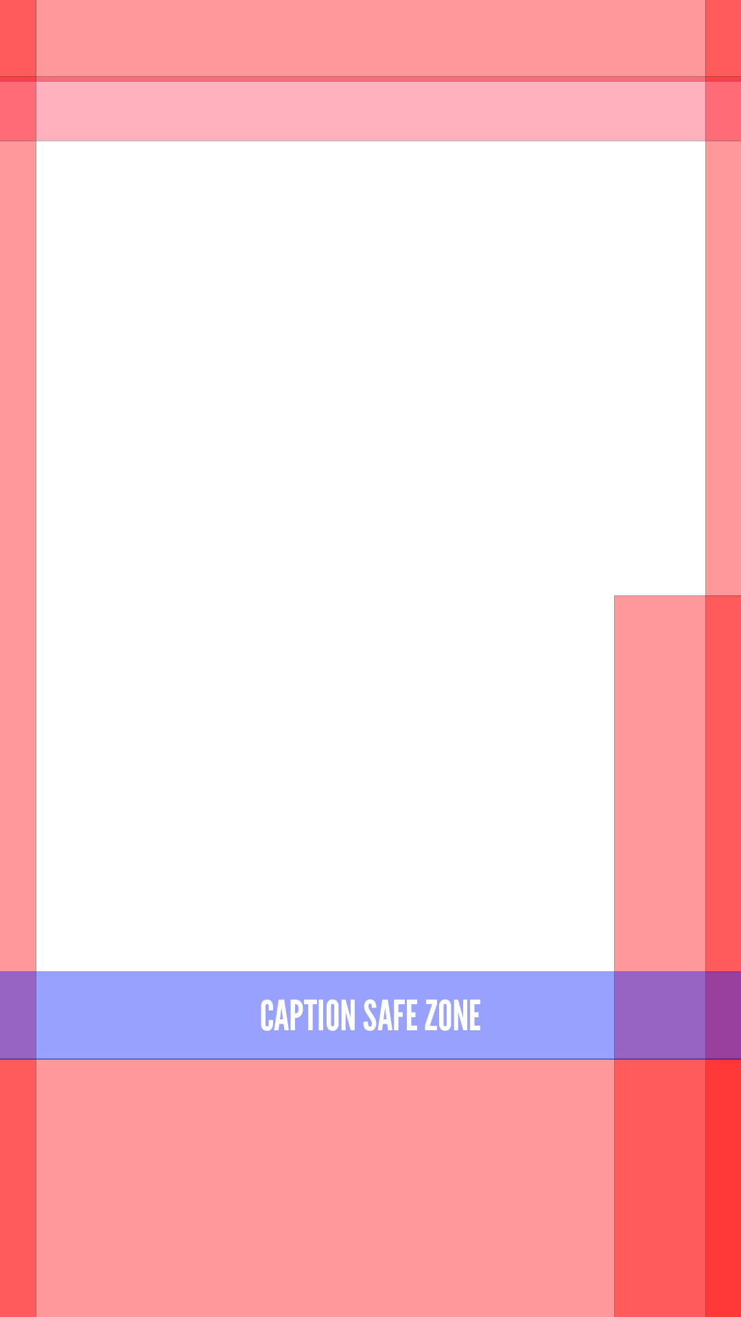
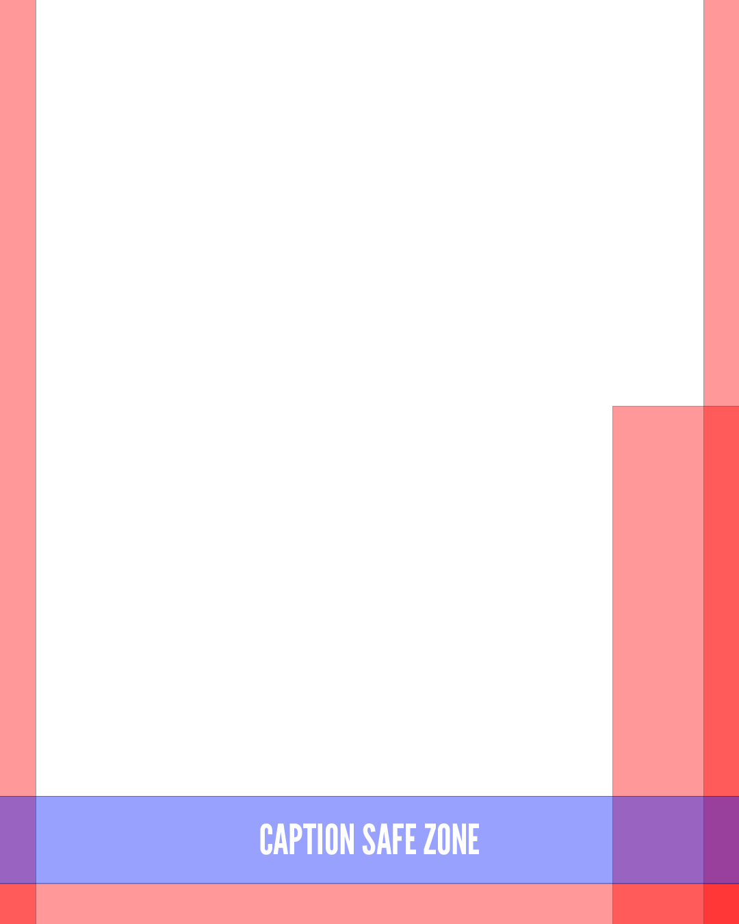

The two aren't interchangeable — don't stretch the 9:16 overlay onto a 4:5 cut. A 4:5 frame loses the tall top and bottom bands but keeps the action rail down the right, so the clear area sits in a different place. Use the file that matches the ratio you're delivering.
Reels and Shorts share one safe zone — the same SafeZone.psd covers both, so a 9:16 cut is safe on either platform without reworking it.
| Zone | 9:16 measurement |
|---|---|
| Top clear band | 220px |
| Live area width | 720px |
| Subtitle band | 200px |
| Bottom clear band | 300px |
Attribution sits top-left, the logo bug top-right, both inside the live area.
Open SafeZone.psd05. Attribution Craft
The technique behind every attribution. The PSDs themselves live in each platform playbook — this is how to work with them.
Find Your Template
- • Instagram — 9:16 Reel & 4:5 carousel PSDs → 06. Instagram
- • Facebook & X — 16:9 PSD for X & the shared 4:5 PSD → 07. Facebook & X
- • Square cut or a GIF? 1:1 PSD, for X and YouTube GIFs → 07. Facebook & X
- • YouTube Shorts — yts_attri.psd → 08. YT Shorts
- • YouTube Long Format — 16:9 PSDs → 09. YT Long Format
- • Rented or channel title? Different templates, and the pipe isn't blue → Rented Titles & Channels
- • BTS, a deleted scene or another extra? The second line names what the video is → BTS, Deleted Scenes & Other Extras
- • Title too long for one line? Don't shrink it — switch groups → Long Titles
Templates render in Articulat CF — grab it in 02. Typography. And remember the non-negotiable: attribution must match the shipped template exactly.
Don't Move It
The unit's position is already set — the ‘Attri Corner’ layer inside the Attri group drives the exact corner. Don't nudge it by eye. Reels sit 40px in from the corner, long-format 70px.
Everything else about the unit — type, tracking, the blue pipe, layer order — is baked into the PSD and shouldn't be rebuilt. The full build spec lives on the statics page if you ever need it.
Long Titles — Use the TWO LINE Group
A long title doesn't get squeezed. Don't shrink the type, don't tighten the tracking, and don't let it run on towards the middle of the frame. The PSD already ships the answer: every attribution template carries two layer groups — ONE LINE and TWO LINE. Switch on the one you need and turn the other off.
- • ONE LINE — the default, for anything that sits comfortably on a single line (Kantara: A Legend).
- • TWO LINE — for long titles (Shubh Mangal Zyada Saavdhan). The group holds its own double line text layer, a taller pipe and its own gradient, already built to spec. Set your title across the two lines and leave the rest of the group alone.
Both groups live in the same file, so the corner and the margins don't move when you swap. The pipe grows with the stack — 20 × 130px on one line, 20 × 200px on two — which is exactly why it has to come from the group rather than be stretched by hand. Full build spec on the statics page.
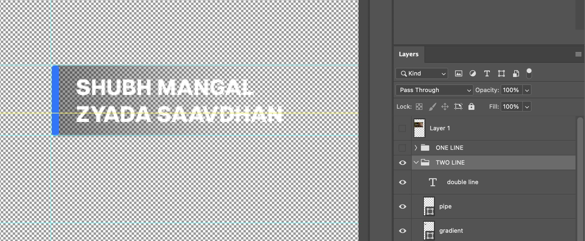
TWO LINE visible, ONE LINE switched off — the group carries its own double line text, pipe and gradient.
The title itself only ever runs to one or two lines — those are the two groups in the file. The only three-line template is the channel one, and that third line is the channel name, not more title.
Working with the Gradient
The gradient sits behind the title to hold it legible over footage. It is not a fixed element — adjust it on every asset.
- • Length: Resize the gradient to match the width of your title text. It shouldn't run well past the text, or stop short of it — retitle a shorter or longer name and the gradient needs resizing with it.
- • Opacity: Anywhere between 20% and 80% — set it by what's behind it. Bright or busy footage needs more; darker, cleaner shots need less. Use the lightest setting that still keeps the text readable. The shipped PSDs open around 30%, which is a starting point, not a default.
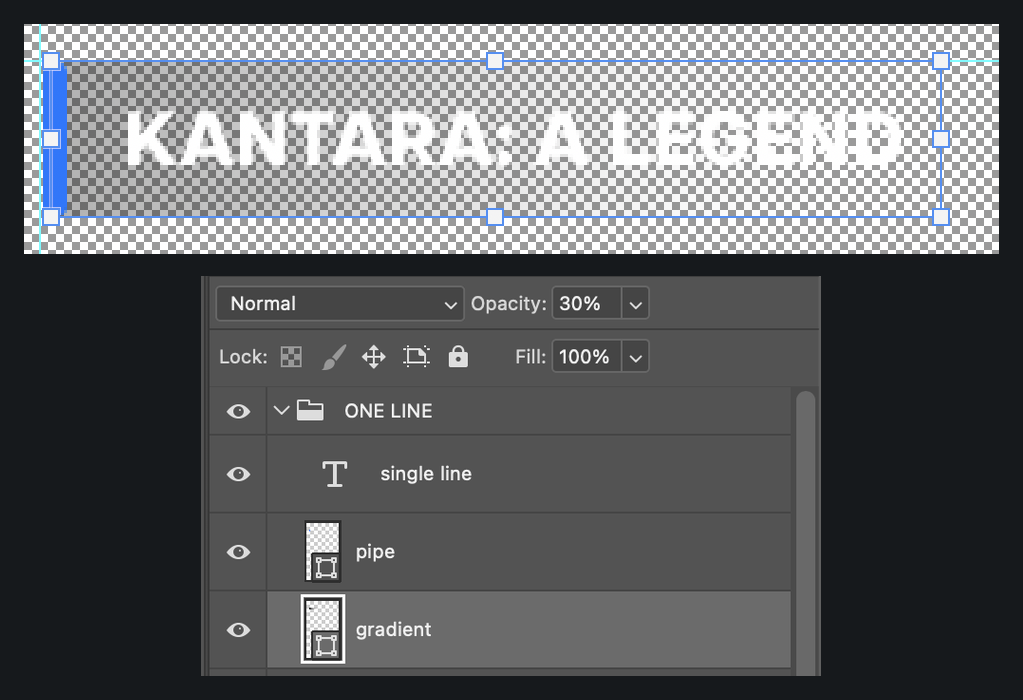
The gradient layer selected — its bounding box tracks the width of the title. Opacity is set at the top of the Layers panel.
Rented Titles & Channels
Not everything on Prime Video is a Prime Video title. Two kinds have to be declared in the attribution, and they are not the same thing.
A one-time rental payment on Prime Video. The viewer pays for that title, once.
A subscription people add on inside Prime Video — Eros Now, Lionsgate Play, Sony Pictures Stream, MUBI. Use a clip from one and the channel gets named.
Prime Video's own titles carry the Prime Blue pipe. Rent and channel attributions don't — pipe and type are white or black, and the only thing that decides which is how bright the shot behind it is. White is the default and covers roughly 90% of cuts. Black is the exception, for a genuinely bright frame — a sky-only shot, say.
Rented titles — when “Rent Now” appears
- • Everything in the video is a rented title — no Rent Now in the attri. That call-out goes in the video description instead. This is the normal case.
- • Rented titles mixed with non-rent titles — only then do the rented ones carry Rent Now under the title, so it's clear which of them the viewer has to rent. Rare — don't reach for it by default.
Put a rented title in a cut and the copyright line goes at the very bottom of the frame — no exceptions. This applies to every rented title, whether or not its attri carries the RENT NOW text. It's not optional dressing; a rented title has to carry its rights holder. The file is below.

The default — no Rent Now

Black — only when the frame is bright

Mixed with non-rent titles — with Rent Now (rare)

4:5 — single line, no rent text

4:5 — with Rent Now (rare)
The copyright line
Sits centred at the very bottom of the frame, under everything else. Set in Articulat CF Extra Bold, white, all caps, held back to about 40% opacity so it reads without competing with the cut. The supplied file carries its own soft bottom gradient to keep the line legible over footage.
The line names the rights holder of the unit you're using, so it changes with the publisher — different studio, different line. Never ship the one sitting in the file. The copyright folder holds the wording for each publisher; take the one that matches your title, and check the year with it.
Where it sits on a 9:16 frame

Close up — this wording is an example, not a default. The PSD holds more than one line; pick the publisher you need.
Channels — name the channel under the title
Title on the first line in Extra Bold, channel name underneath in Regular. If the title is long enough to wrap, it takes two lines and the channel drops to a third — that's what the 3-line file is for.

Standard — 2 lines

Black — bright frame only

Long name — 3 lines

Channel on the 4:5 carousel — same lockup, smaller
The gradient behind the text follows the same rules as every other attribution — resize it to the title, set the opacity by what's behind it. See Working with the Gradient above.
The templates
Each PSD holds its variants as layer groups — switch the one you need on and the rest off. One combination isn't shipped because it almost never comes up: black + Rent Now. If you hit it, modify the PSD. And whichever rent unit you use, the copyright line goes on with it — every rented title, every time.
BTS, Deleted Scenes & Other Extras
Not every cut is a lift from the show. Some of them are the material around it — a behind-the-scenes reel, a deleted scene, a making-of. When the video shows more than what's in the show, the attribution says which of those it is.
The lockup is one you already know, doing a second job. Title on the first line in Extra Bold, and underneath it in Regular, what the video is. Same shape as a channel attribution — except the second line names the kind of video, not a channel.

9:16 — a deleted scene

4:5 — behind the scenes
A BTS or deleted-scene cut is still a Prime Video title, so it keeps the Prime Blue pipe. Only rent and channel attributions drop it for white or black — don't carry that habit across.
There isn't a separate template per kind of extra. DELETED SCENE and BTS are what the shipped files happen to be set to — retype that line for whatever the video actually is. The same pair covers deleted scenes, behind the scenes, making-of and anything else in that family. Everything else about the unit — corner, pipe, type, gradient — stays exactly where the PSD puts it.
The templates
The 9:16 file carries the TWO LINE group only — the descriptor is the second line, so there's nothing to switch. The 4:5 file holds both groups; turn two lines on and single line off, the same way as every other template — Long Titles. Only these two ratios ship; for anything else, ask before you build one.
Platform Playbooks
Everything for the platform you're cutting — format, attribution, logo placement, end slates. Cut to the preferred ratio unless the brief says otherwise; second choices are fallbacks, not equivalents. Craft rules (04–05) apply everywhere.
06. Instagram
Reels, stories and carousels.
Formats
1080 × 1920
1080 × 1350
⚠️ 4:5 is for non-shoot-based editorial assets only. Shoot-based assets — Watch Now and the like — must always be 9:16.
- Reel sequence1080 × 1920, 30fps, Rec 709, square pixels, progressive
Attribution PSDs
Carousels — the same file serves Facebook and X. Don't rebuild it per platform.
Download 4:5 PSDAdjust the gradient on every asset — 05. Attribution Craft.
End Slates (IG, FB & X)
Rare in practice. Don't add one by default — the team will tell you when an asset needs it.
When you are asked for one, these are the cases it covers:
- • Watch Now and Trending assets — whether or not the video has a direct callout.
- • Dated end slates on pre-launch assets.
- • Where a video has no direct callout at the end and would otherwise feel out of context.
Worked example: a cut of Tammannah getting flowers wasn't obviously connected to Odella, so it carried the end slate to give it context.
Match the current visual style — @primevideoin Reels →
07. Facebook & X
16:9 attribution for X, and the shared 4:5 attribution across Facebook & X.
1080 × 1350
1080 × 1920
❌ No logo bug on the right.
X / Twitter
1920 × 1080
1080 × 1350
❌ No logo bug on the right.
Attribution PSDs
One file across Instagram, Facebook and X — don't rebuild it per platform.
Download 4:5 PSDEnd slates on FB & X follow the same rules as Instagram — see End Slates ↑
Which Guide to Follow
Neither platform has its own attribution, subtitling or sizing rules — every video format borrows from Instagram or YouTube. Find your ratio and follow that guide.
| Format | Follow | Typical use |
|---|---|---|
| 9:16 Reels (FB) | IG Reel | Reels |
| 4:5 video (FB + X) | IG 4:5 video | Memes and scene lifts |
| 16:9 video (FB + X) | YT 16:9 long format | Long scene lifts, compilations |
Static posts for both platforms — sizing, attribution and subtitles — are on the statics page.
08. YouTube Shorts
Format & Logo
1080 × 1920
- • Logo in White, top-right.
- • Held throughout the video.
- • Gone before the end slate — on the rare asset that has one.
- • Drop-in overlay with the bug already in position: 9:16 placement PNG.
Attribution
In the youtube-Attri Drive folder — the 2026 set replaces every earlier YT PSD.
Subtitles
Shorts use the same subtitle settings as Instagram Reels — same font, size, stroke, shadow and gradient. Nothing changes between the two, so load the same preset and carry on.
Safe zone is shared too — the same SafeZone.psd as Reels: 220px top · 720px live width · 200px subs band · 300px bottom.
Subtitle Settings & Safe Zones — 04Delivery Spec
The one row that covers Shorts, from the delivery matrix.
- Dimension
1080 × 1920 - Opening animationNo — Shorts start on the cut
- Flip bugTop right, at 75% opacity
- Title bugFrom the .mogrt template
- SubtitlesEmbedded English subs — burnt in, no separate SRT
- End page titleShow / movie logo
- Join Prime CTA— not on Shorts
- Prime Video outro— not on Shorts
- Export
H.264 MP4 · 15 Mbps· Audio−6 dB
09. YouTube Long Format
4K 3840 × 2160 · HD 1920 ×
                        1080
Flow of YTLF (Editorials)
The four beats in order, each one shown as the frame it actually is. Click any of them to open it full size.
-
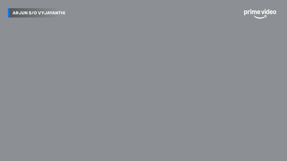 16:9 · attribution PSD
01
16:9 · attribution PSD
01Video with attribution and Prime Video bug
Attribution top-left, Prime Video logo unit in white top-right. Straight out of
1080_YT_normal.psd— the grey is where your footage goes. Letterboxed cuts use the same file, with both units moved inside the picture.The 2026 set replaces every earlier YT PSD, and the Shorts PSD sits in the same folder — see 08. YT Shorts.
-
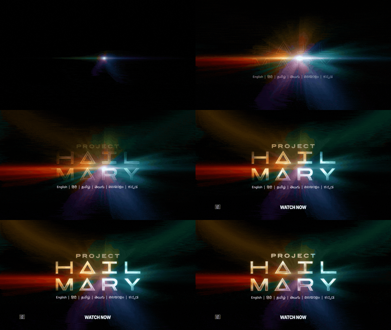 16:9 · example
02
16:9 · example
02Title slate Only if one exists
Newer titles usually have one; older ones often don't, so skip this step rather than building your own.
Example: Project Hail Mary — logo, language list, Watch Now and the maturity rating.
— Comes with the title, no folder -
 16:9 · animation
03
16:9 · animation
03Outro logo animation
The logo draws on over a full Prime Blue frame. Take the file — don't rebuild it.
-
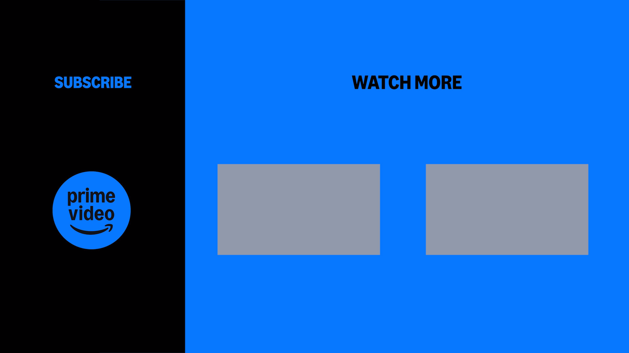 16:9 · artwork
04
16:9 · artwork
04End card
Subscribe panel on the left, Watch More slots on the right — drop the two thumbnails into the grey boxes.
Hold the end card a minimum of 10 seconds.
No intro animation on editorials — see the note below for trailers and other non-editorial assets.
Before you cut, watch recent uploads on the channel — the flow is easiest to get exactly right by seeing it in practice.
▶ Prime Video IN on YouTube⚠️ Subtitles ship as a separate SRT — never burnt in
This is the one every new editor gets wrong,
because on Reels and Shorts the opposite is true — there subs are burnt into
the picture. On YouTube long format the picture stays clean and the subtitles travel as their
own .srt file.
✕ Burnt into the picture
The line is baked into the frame. It can't be turned off, translated or corrected after export.
✓ Separate .srt file
subtitles.srt00:01:12,400 → 00:01:14,900
I'm not going back there.
Same line — it just lives in the file instead of the frame. YouTube switches it on and off for the viewer.
So the subtitle styling in 04 — Subtitles & Safe Zones does not apply here. Font, stroke, shadow and safe zones are for burnt-in work — Shorts and social cuts. Nothing to style on a long format.
⚠️ Letterboxing — and where the units go if you keep it
On YouTube long format, avoid letterboxing. If the source arrives with bars, zoom in so the picture fills the 16:9 frame.
✕ Bars left in
Dead black across the top and bottom of a 16:9 delivery.
✓ Zoomed to fill
Same shot, scaled up. The picture fills the frame — this is the default.
Keeping the letterbox for a cinematic look?
Then the attribution and the logo unit both have to sit inside the picture. Not on the black, and not half-on-half-off across the edge.
✕ On the black bar
Floating on dead black, outside the picture.
✕ Across the edge
Straddling the bar and the picture — the worst of the three.
✓ Inside the picture
Both units fully inside the active picture, clear of the bar.
🎬 Flow Assets
Every file linked on the beats above, in one folder — the flow files sit under YouTube Assets (Main folder), the PSDs in youtube-Attri inside it.
Open Branding AssetsLogo Unit
- • Trailer / Asset units — Prime Video rotating logo unit with the Join Prime CTA.
- • BAU units — Prime Video logo unit only.
 16:9 · rotating unit
The rotating unit at true size — it flips to Join Prime and back. Editorials use the plain logo unit instead, as in beat 01 above.
Placement & Timing
- • Editorial LFs — logo unit in White, top-right.
- • Asset LFs — logo in White, bottom-left; top-left where the asset type / source calls for it.
- • Watch More card after the title end slate — hold the end card a minimum of 10 seconds.
- • Drop-in overlay for the top-right editorial placement: 16:9 placement PNG.
Delivery Spec
The two organic YouTube rows, as listed on the delivery sheet. Both deliver at 4K.
| Full Trailers | Promotional Videos | |
|---|---|---|
| Dimension | 3840 × 2160 UHD |
3840 × 2160 UHD |
| Opening animation | Yes | Yes |
| Flip bug (75% opacity) | Top left | Top right |
| Title bug | NA | NA |
| Subtitles | Separate SRT English subs | Separate SRT English subs |
| End page title | Show / movie logo | Show / movie logo |
| CTA | Join Prime | Join Prime |
| Outro | Prime Video | Prime Video |
| Maturity rating | Required — on the title slate | — |
| Export | H.264 MP4 · 50 MbpsAudio −6 dB |
H.264 MP4 · 50 MbpsAudio −6 dB |
Two things worth reading twice:
- • Subs ship as a separate SRT here, not burnt in. That is the opposite of Shorts and every social cut — the subtitle styling in 04 is for burnt-in work.
- • The bug flips corner by asset type. Trailers sit top left, promos top right — which is the "top-left where the asset type calls for it" case in the placement rule above.
- • These rows are asset deliveries. Editorials still follow the four-beat flow with no intro animation.
Non-Editorial Assets
The four-beat flow above applies to editorials. Non-editorial assets — trailers and similar — still open with the Prime Video logo intro animation before the video begins.
 16:9 · intro
Prime Video logo intro animation
Runs before beat 01. Shipped with an alpha channel — shown here over a flat ground so the white logo reads.
Editorials skip this.
Ship It
Export, check, deliver.
10. Delivery Matrix
Every format PV India delivers, and what each one carries. The sections above tell you how to build a cut; this tells you what to hand over.
Where this comes from
The table below is typed up from the PV delivery spec sheet. That sheet is the live document — if it has moved on and this table hasn't, go by the sheet and tell us so we can fix it here.
Open the Delivery Spec Sheet →Flip bug sits at 75% opacity in every row that has one.
| Format | Dimension | Opening | Flip bug | Title bug | Subs | End page | CTA | Outro | Export | Ref |
|---|---|---|---|---|---|---|---|---|---|---|
| Organic — PV | ||||||||||
| YouTube — Full Trailers | 3840 × 2160 UHD |
Yes | Top left | NA | Separate SRT | Show / movie logo | Join Prime | Prime Video | H.264 MP4 50 Mbps · −6 dB | ↗ |
| YouTube — Promotional Videos | 3840 × 2160 UHD |
Yes | Top right | NA | Separate SRT | Show / movie logo | Join Prime | Prime Video | H.264 MP4 50 Mbps · −6 dB | — |
| For Talent (IG) | 1920 × 1080 HD |
No | Top left | Yes | Embedded | Show / movie logo | Join Prime | Prime Video | H.264 MP4 15 Mbps · −6 dB | — |
| Social 16×9 (IG) | 1920 × 1080 HD |
Yes | Bottom left | NA | Embedded | Show / movie logo | Join Prime | Prime Video | H.264 MP4 15 Mbps · −6 dB | ↗ |
| Social 1×1 | 1080 × 1080 |
No | No bug | NA | Embedded | Show / movie logo | Join Prime | Prime Video | H.264 MP4 15 Mbps · −6 dB | — |
| Social 4×5 | 1080 × 1350 |
No | No bug | NA | Embedded | Show / movie logo | Join Prime | Prime Video | H.264 MP4 15 Mbps · −6 dB | — |
| Social 9×16 (Story / Reel) | 1080 × 1920 |
No | No bug | NA | Embedded | Show / movie logo | — | — | H.264 MP4 15 Mbps · −6 dB | ↗ |
| YT Shorts | 1080 × 1920 |
No | Top right | .mogrt | Embedded | Show / movie logo | — | — | H.264 MP4 15 Mbps · −6 dB | — |
| VAM — Original titles | 3840 × 2160 UHD |
Yes | Bottom left | NA | Separate SRT | Show / movie logo | NA | Prime Video — Included with Prime | ProRes HQ .mov · unmixed 5.1 or stereo | ↗ |
| Clean | 3840 × 2160 UHD1920 × 1080 HD |
No | No bug | No title bug | Separate SRT | Show / movie logo | — | — | ProRes HQ .mov · unmixed DME tracks in stereo | — |
| Paid — PV | ||||||||||
| YT Paid & 16×9 Social Paid | 1920 × 1080 HD |
Yes | Top left | Top right | Embedded | Show logo | Join Prime Lite @ 67 | — | H.264 MP4 15 Mbps · −6 dB | ↗ |
| Social 1×1 | 1080 × 1080 |
Yes | Top left | Top right | Embedded | Show logo | Join Prime Lite @ 67 | — | H.264 MP4 15 Mbps · −6 dB | ↗ |
| Social 4×5 | 1080 × 1350 |
Yes | Top left | Top right | Embedded | Show logo | Join Prime Lite @ 67 | — | H.264 MP4 15 Mbps · −6 dB | ↗ |
| 9×16 Story & Reels | 1080 × 1920 |
Yes | Top left | Top right | Embedded | Show logo | Join Prime Lite @ 67 | — | H.264 MP4 15 Mbps · −6 dB | ↗ |
| YT TV Masthead | 970 × 250 |
Yes | Top left | Top right | Embedded | Show logo | Join Prime Lite @ 67 | — | H.264 MP4 15 Mbps · −6 dB | — |
| TVC | ||||||||||
| TVC — HD | 1920 × 1080 |
Yes | Bottom left | NA | No subs | Show logo | Join Prime Lite @ 67 | — | ProRes 422 HQ .mov · −6 dB · start TC 00:00:00:00 |
↗ |
| TVC — SD | 720 × 576 |
Yes | Bottom left | NA | No subs | Show logo | Join Prime Lite @ 67 | — | ProRes 422 HQ .mov · −12 dB · start TC
00:00:00:00 |
↗ |
Scroll the table sideways to see every column →
Maturity rating. YouTube Full Trailers carry the title's maturity rating on the title slate — use the correct rating for that show, set below the title.
Audio level. The −6 dB (−12 dB on TVC SD) figure is the delivery level for the master. Per-element targets — dialogue, music, SFX — are in 11. Technical Specs.
11. Technical Specs
Export Settings
- 🎞️ Format: H.264 / H.265 (MP4)
- 📉 Bitrate: 15-20 Mbps (Target) / 25 Mbps (Max)
- ⏱️ Frame Rate: Match Source (usually 24/25/30fps) — except IG Reels, which cut at 30fps
- 🎨 Colour Space: Rec 709
- 📏 Resolution: per platform — see the Platform Playbooks
Audio Targets
- 🗣️ Dialogue: -6dB to -12dB (Clear & Present)
- 🎵 Music: -18dB to -24dB (Background)
- 🔊 SFX: -10dB to -15dB (Accents)
- 📢 Master Peak: -2dB (Never clip at 0dB)
12. Editor's Pre-Flight
Ready to Render?
Verify these before hitting export. General checks apply to everything — pick a platform for its extra checks.
All Assets
Quick access to everything.
📖 Guidelines
The Agency Playbook is the current source of truth. This site is the working summary — when the two disagree, the playbook wins.
Open Agency Playbook x PV — 2026 →📁 Asset Folders
Direct links to Google Drive folders.