References & Examples

Cuts that have shipped, and what each one did to the subtitles. Watch a few before you start experimenting.

00

00. Before You Start

The playbook says stylized subtitles have “more flexibility” without saying how much. These are the cuts that show you.

What Never Changes

BANDRA

✓ Stroke + hard shadow

BANDRA

✗ Without

  • Type over footage gets a stroke and a hard drop shadow, coloured words included. Never a soft glow. Footage is unpredictable, and this is the only thing that keeps a caption readable when the shot turns bright. The exception is type on a background the edit designs — a solid colour block, a white canvas — where the contrast is already solved. Two entries here do that, and both say so.
  • The shadow sits tight and very dark — almost touching the glyph, not thrown off it. Look closely at any still on this page: the thick stroke does the separating, and the shadow only stops the letter floating. If you can see a gap, it's too far.
  • The attribution bug — position, styling and hold time as the playbook sets them, and updated per clip when the edit spans several titles.
  • Safe zones — text roams anywhere inside the live area, and nowhere outside it.
  • Accent colours from the PV secondary palette, not invented.
  • Only the beats get treated. Ordinary lines stay plain white — that contrast is the whole effect.

Two design-led entries qualify one of these. Both are flagged on the entry itself — if you find yourself about to break one of these rules and there's no flag saying you can, that's the moment to ask.


01

01. Subtitle Craft

The type layer is doing the entertaining. The first three are subtitle treatments, roughly in order of how far they go; the last is a lyric video, where the type stops describing the audio and becomes the thing you watch.

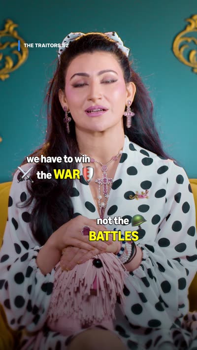
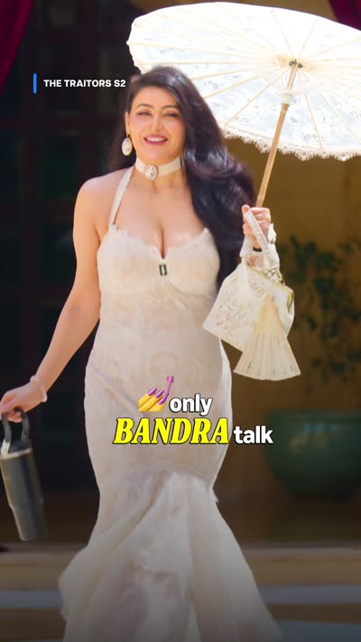
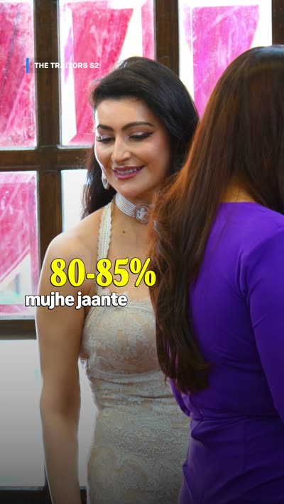
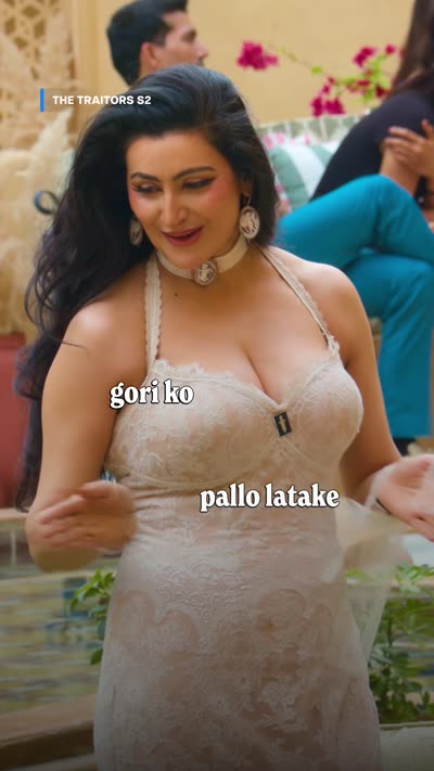
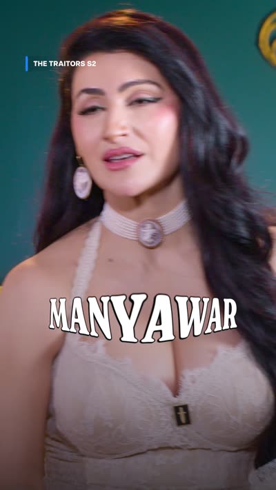
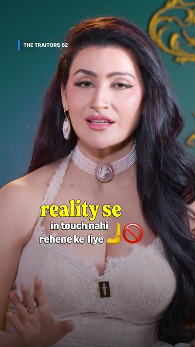
The Traitors S2 — Shalini editorial

9:16 · 0:33 · Typography
'reality se' in large yellow type above two smaller white lines, emoji at the end Two caption blocks in one frame, 'we have to win the WAR' mid-frame and 'not the BATTLES' lower 'only BANDRA talk' with BANDRA in yellow italic capitals '80-85%' in large yellow type, left-aligned mid-left of the frame Song lyric fragments placed at two different points in the frame A caption set as a heavy outlined display wordmark reading MANYAVAR
  • Canary yellow on the one word carrying the joke, at roughly double size
  • Caps on the highlight, sometimes italic, against a lowercase base line
  • Captions off the bottom band — left-aligned, off-centre, two blocks at once
  • Emoji inline at the end of a line
  • Song lyrics scattered on the beat instead of stacked
  • One caption drawn as a display wordmark, as a gag

⚠️ The wordmark gag imitates a real clothing brand. Clear that with the client before reusing it — the safe technique is the oversized display caption, not the specific brand.

Watch the cut →

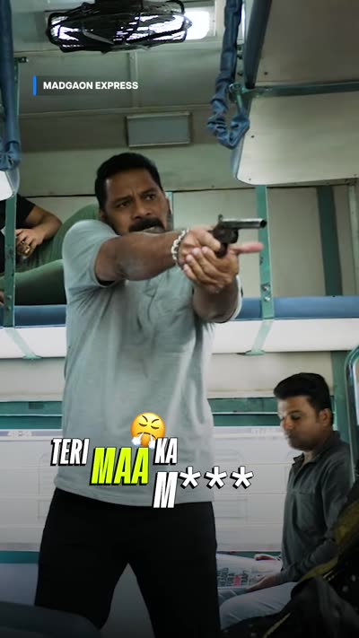
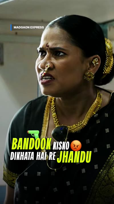
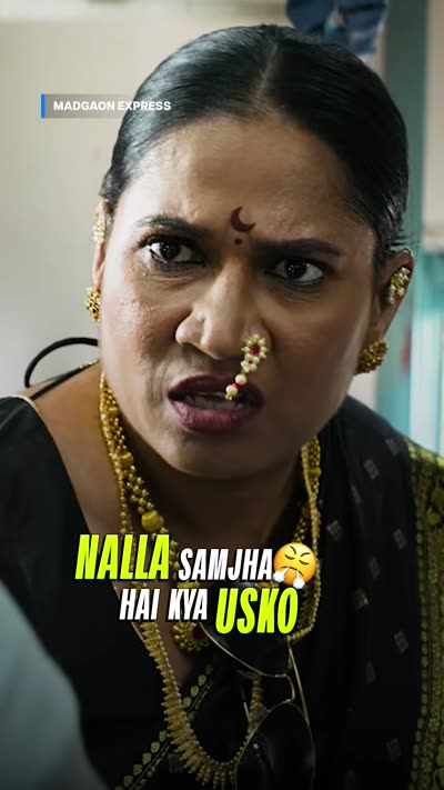
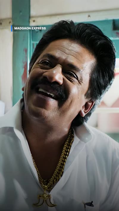
Madgaon Express — scene lift

9:16 · 0:26 · Fun subs on a scene lift
All-caps caption 'TERI MAA KA M***' with MAA in yellow and the swear masked All-caps caption with BANDOOK and JHANDU in yellow, the rest white All-caps caption with NALLA and USKO in yellow and an emoji inline All-caps caption 'MOMENT MAT BANA' with a reaction emoji beside the face
  • Whole subtitle track in caps and italic, not just the highlight
  • Yellow alternates through the line, landing on the words that carry the insult
  • Emoji floating by the face as reaction beats, not parked in the text
  • Swearing masked with asterisks rather than cut
  • Bottom-left, inside the live area
Watch on Instagram →

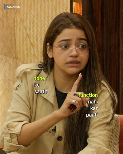
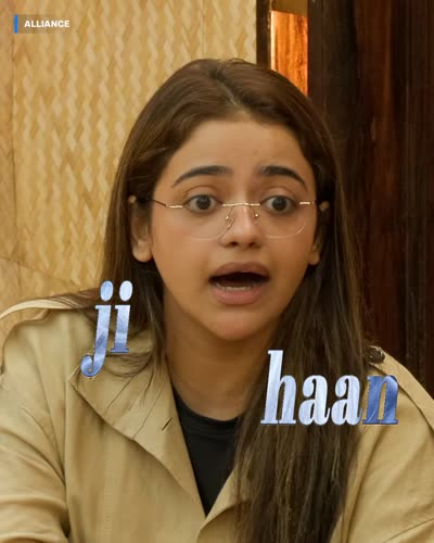
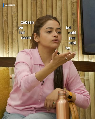
The Alliance — playful subtitles

4:5 · 0:38 · Playful subtitles
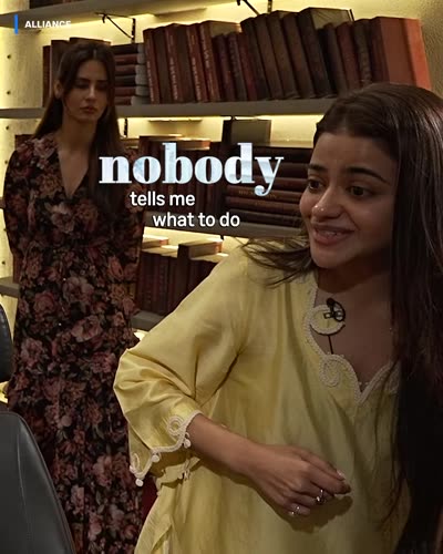
Caption with 'tone' and 'function' picked out in green among smaller white words 'ji haan' set large in a blue serif face One sentence broken into fragments placed left and right of the subject 'nobody tells me what to do' with 'nobody' large and serif
  • Words scattered around the frame instead of one centred block
  • Green and blue accents in the same cut
  • Single words swapped to a serif or display face
  • A sentence split across two separate positions
  • 4:5 feed post — captions still well inside the live area

⚠️ The outlier. It works because the show is fast and chaotic — on a calmer title the scatter reads as sloppy, not playful.

Watch on Instagram →

Bandish Bandits S2 — lyric video

4:5 · 0:44 · Lyric video for a song
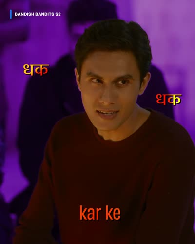
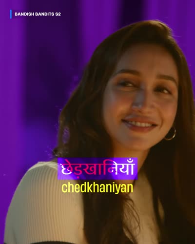
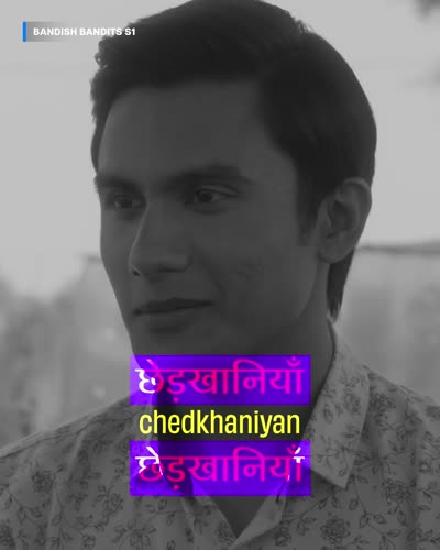
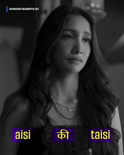
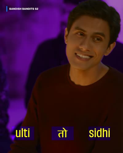
Two Devanagari words placed at opposite corners of the frame in orange, with 'kar ke' lower left Devanagari lyric on a solid purple block with its yellow Latin transliteration directly beneath The same lyric word stacked three times in different colours as a visual echo A line reading 'aisi की taisi' with Latin and Devanagari mixed, each word in its own purple block A line reading 'ulti तो sidhi' spread across the frame width in yellow on purple blocks
  • Devanagari and its Latin transliteration set together, so the lyric reads either way
  • Scripts mixed inside a single line — aisi की taisi
  • Each word in its own solid colour block, spread across the frame width rather than stacked in a caption
  • Words repeated in layers as a visual echo when the vocal repeats
  • Type placed to the beat, not to a fixed subtitle position
  • Bug switches between S1 and S2 as the edit crosses seasons

⚠️ No stroke and no shadow anywhere in this one. The colour block behind each word does that job instead, and the whole piece rides a single purple grade. That works because the background is designed rather than found — it is not licence to drop the stroke on captions over ordinary footage.

Watch on Instagram →
02

02. Character Edits

Built around one character or performer, often across several titles. Watch the bug in all three — it changes with the clip.

Baby John — character edit from a film

9:16 · 0:26 · Character edit from a movie
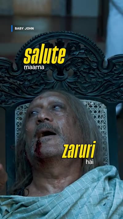
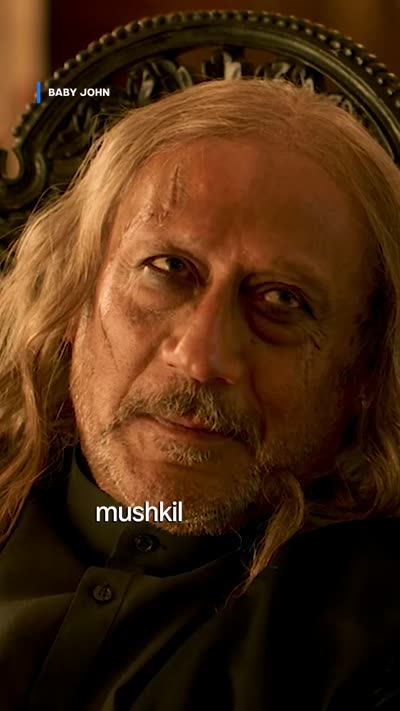
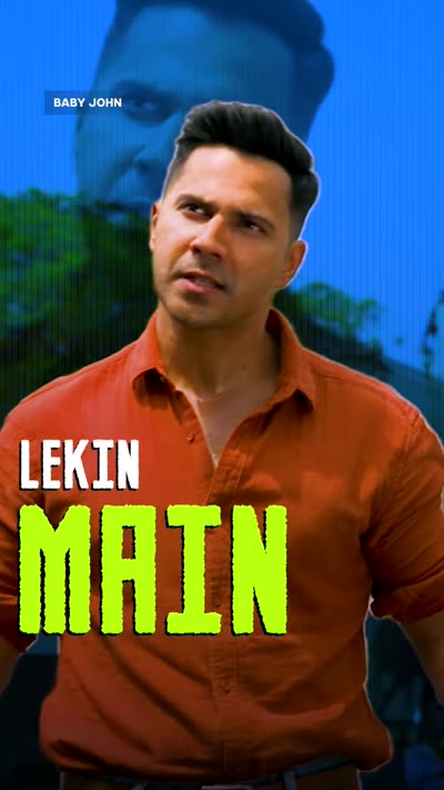
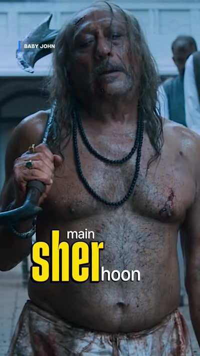
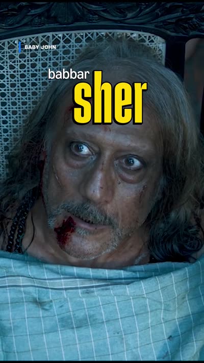
'main SHER hoon' with SHER in large yellow type 'babbar SHER' with SHER in large yellow type Two caption blocks, 'salute maarna' upper left and 'zaruri hai' lower right 'mushkil hai na' in plain white type
  • Captions follow the song lyric, not the dialogue
  • Built word by word so the hook lands on the beat
  • Small white setup, big yellow italic payoff — the same shape every line
  • One lyric split across two positions in the frame
  • Lines without a hook get no treatment at all
Watch on Instagram →

Triptii Dimri — no subtitles

9:16 · 0:21 · Character edit without subs
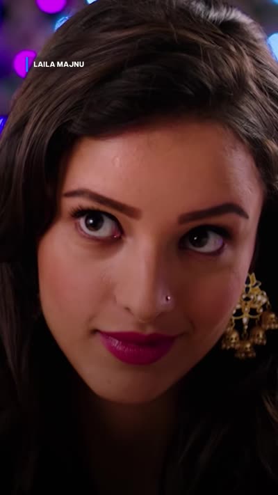
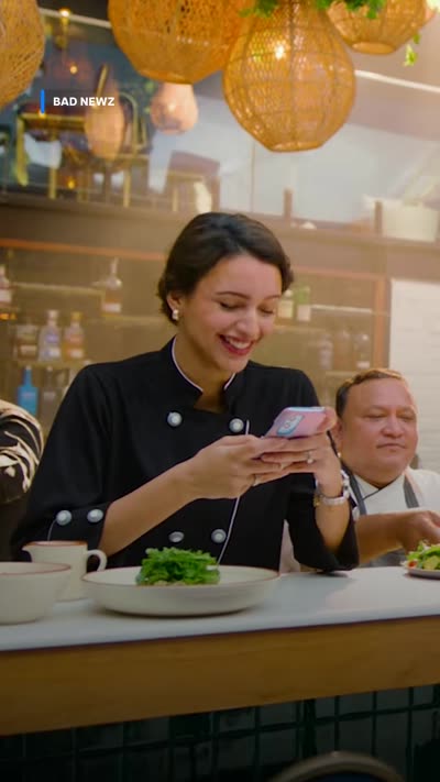
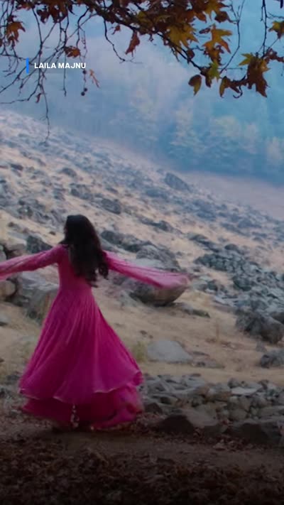
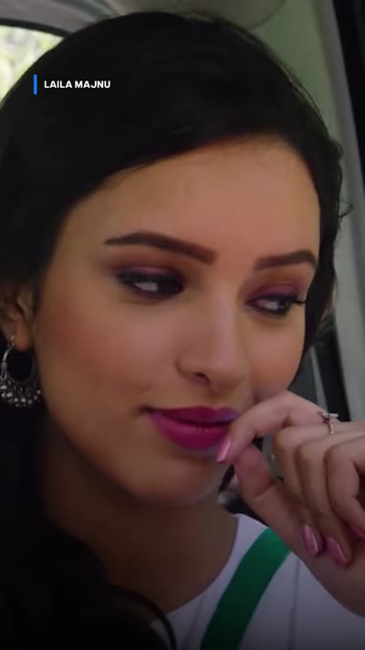
Close-up with no subtitles and a top-left bug reading LAILA MAJNU Different scene with no subtitles and a top-left bug reading BAD NEWZ Wide landscape shot with no subtitles and a small top-left bug Close-up with no subtitles and a top-left bug reading LAILA MAJNU
  • No text on screen at all except the bug — music and performance carry it
  • Clips from two films in one post, held together by the performer
  • Bug switches between LAILA MAJNU and BAD NEWZ as the clip changes — with no subtitles it is the only branding in the piece
  • Cuts land on the beat; frames left clean
Watch on Instagram →

Varun Dhawan — character edit with dialogue

9:16 · 0:23 · Character edit with dialogue
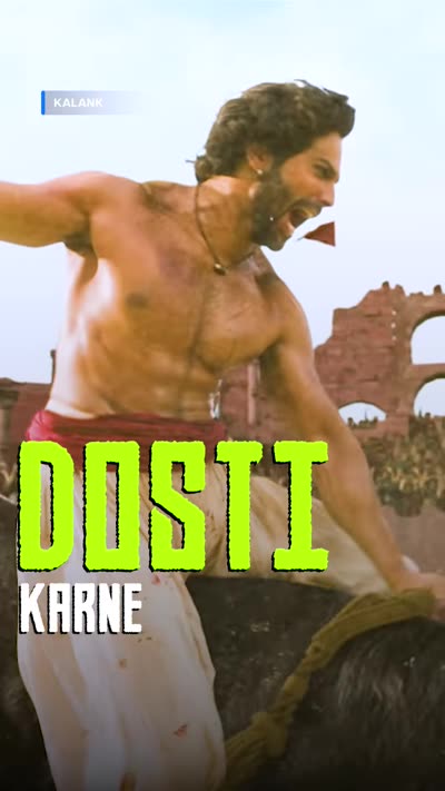
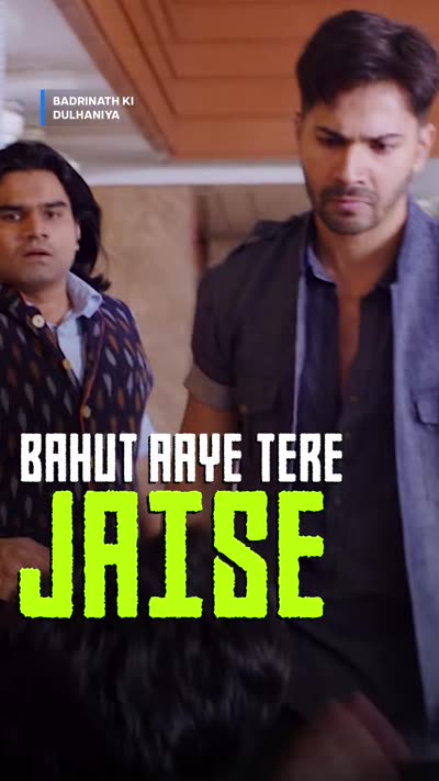
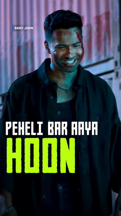
'LEKIN' small and white above 'MAIN' large in acid green 'DOSTI' very large in acid green with 'KARNE' smaller beneath 'BAHUT AAYE TERE' above 'JAISE' in acid green, bug reading LAILA MAJNU 'PEHELI BAR AAYA' above 'HOON' large in acid green
  • One line of dialogue assembled from five different films
  • Same two-tier caption every time — small white setup, huge acid-green payoff
  • All caps in a wide squared display face, locked bottom-left
  • Accent is acid #D8FF00, straight from the secondary palette
  • Bug names the right title in every one of the five
Watch on Instagram →

03

03. Occasion & Campaign

Anniversaries and title marketing. The first two are both anniversary edits and they look nothing alike — because the titles don't. Match the treatment to the tone of the show, not to the brief.

Mirzapur — series anniversary

9:16 · 1:00 · Series anniversary edit
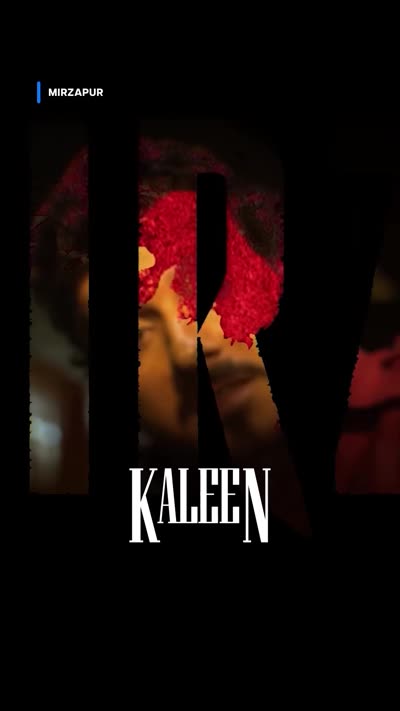
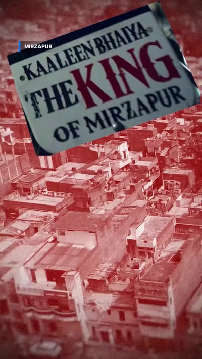
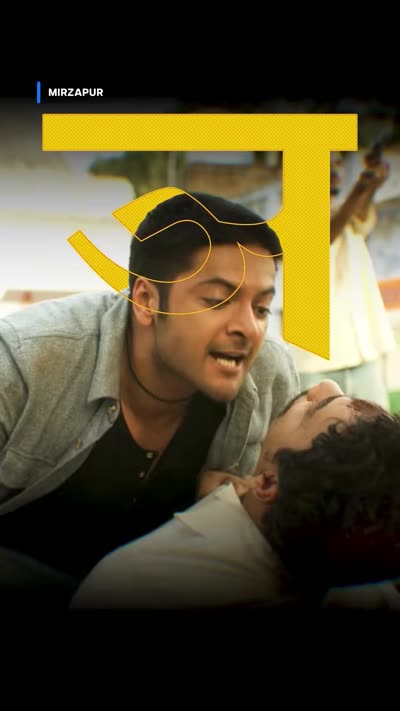
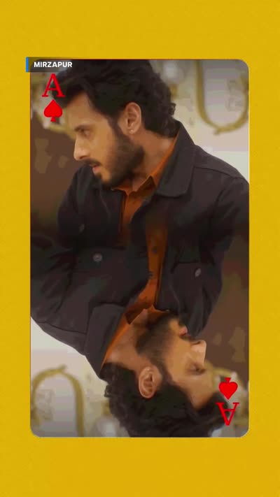
Character name card reading KALEEN BHAIYA in a serif face over a dark frame Torn newspaper headline reading KAALEEN BHAIYA THE KING OF MIRZAPUR An oversized yellow Devanagari letter sitting behind the characters A frame composited inside a playing-card graphic on a yellow ground
  • Character name cards in a serif display face between beats
  • Torn-newspaper headline as a graphic device, not a caption
  • Oversized Devanagari set behind the subject as artwork
  • Frames composited inside playing-card and poster graphics
  • Glitch and VHS passes on selected shots
  • Caps subtitles with masked profanity, yellow and red accents
Watch on Instagram →

Kal Ho Naa Ho — movie anniversary

4:5 · 0:41 · Movie anniversary edit
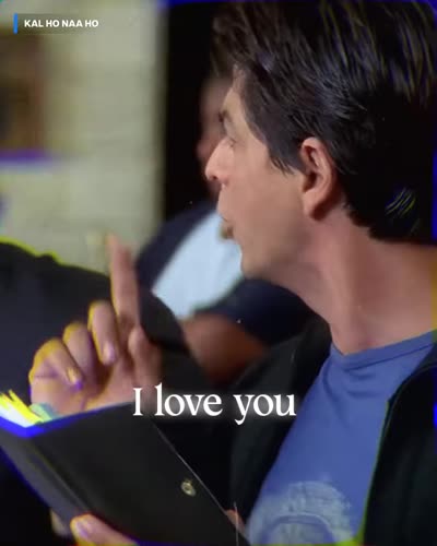
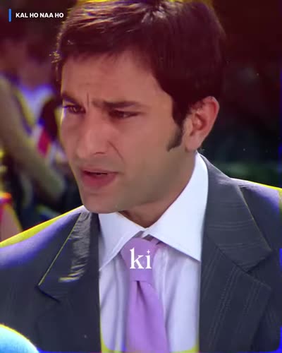
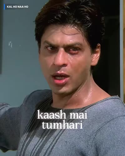
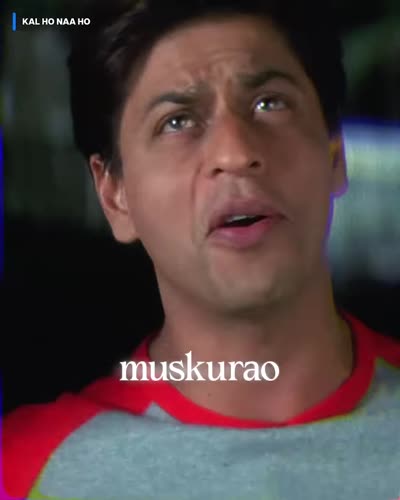
Plain white lowercase subtitle reading 'i love you' with no colour accent Plain white subtitle with a single word set in italic Two-line plain white subtitle over a film frame Single plain white word closing the edit
  • Plain white lowercase throughout — no accent colour anywhere in the cut
  • Italic on the occasional word, and that is the entire treatment
  • No emoji, no caps, no scatter, no display faces
  • Dialogue assembled into one continuous emotional line
  • Multi-panel splits carry the visual interest instead of the type

⚠️ The most useful entry here for a new editor. Restraint was the creative choice — a sincere film gets no jokes. Reach for this register as readily as the loud one.

Watch on Instagram →
Subedaar — title marketing

9:16 · 0:31 · Title marketing
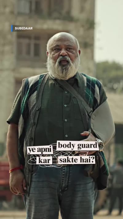
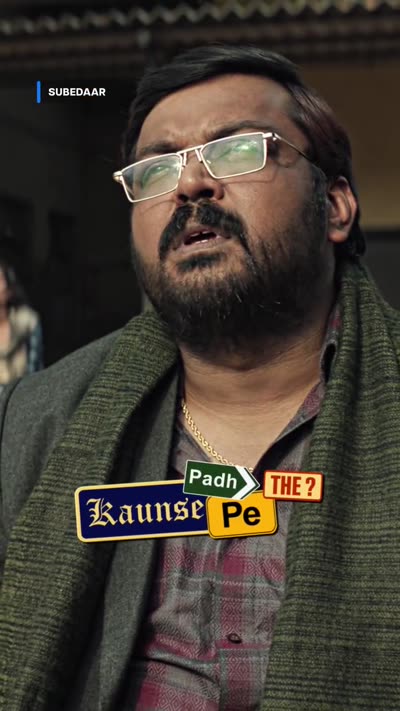
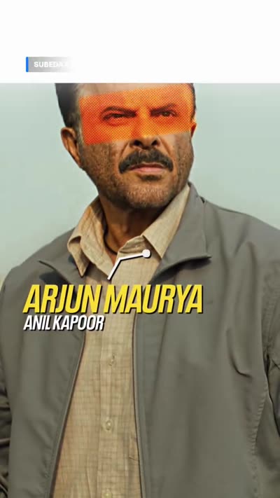
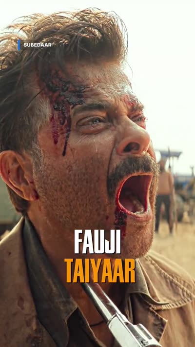
Subtitle built from separate torn-paper chips, each word on its own chip Paper-chip caption reading 'Kaunse Padh Pe THE?' in mixed typefaces Character card reading ARJUN MAURYA above ANIL KAPOOR, with an orange bar across the eyes Caps caption reading FAUJI TAIYAAR in white and yellow
  • Ransom-note captions — every word on its own torn-paper chip, faces mixed
  • Character cards pairing the role name with the actor
  • An orange bar across the eyes as a repeated graphic motif
  • The title wordmark used as a caption in its own right
  • Single title, so the bug never changes

⚠️ Uses a song from the film itself, cleared specially for this campaign. Music permission is per-campaign — never assume a track carries over to the next post.

Watch on Instagram →
04

04. Design-Led

The graphics are the edit. Both of these are heavy lifts — budget the time before you pitch one.

Invincible — kinetic typography

4:3 · 0:40 · High-effort series edit
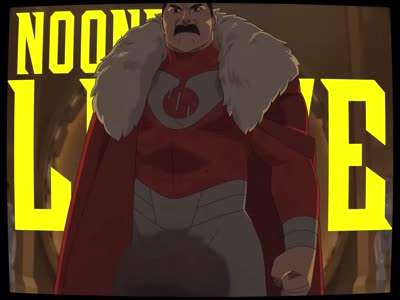
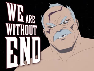
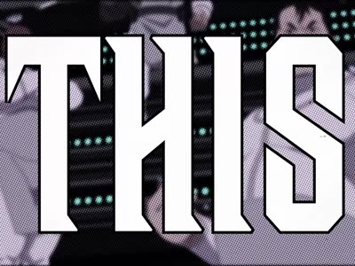
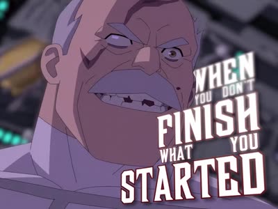
Huge yellow type reading NO ONE LEAVES ALIVE with the character composited in front of the letters Slab-serif type reading WE ARE WITHOUT END wrapping around a character Outlined display type reading THIS filling most of the frame Stacked caption reading WHEN YOU DON'T FINISH WHAT YOU STARTED in mixed sizes
  • Type at frame-filling scale — the words are the composition, not a label
  • Letters masked so characters pass in front of and behind them
  • Several display faces in one cut, matched to the comic-book source
  • Halftone and dot-screen passes on selected shots
  • Comic-panel splits and shifting letterbox instead of one fixed frame
  • Delivered 4:3, not 9:16

⚠️ This one carries no attribution bug, unlike every other reference on this page. Treat that as specific to this piece, not as licence to drop the bug — check before following it.

Watch on Instagram →
Adityaism — editorial style

9:16 · 0:58 · Style edit
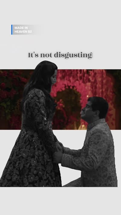
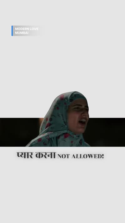
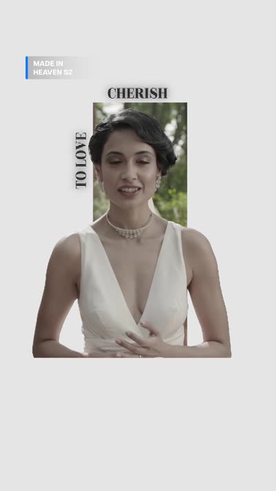
Black serif line on a white canvas above two cut-out video clips Cut-out clips arranged as a collage on white with a Devanagari and Latin caption Caption mixing Devanagari and Latin with a word set vertically beside the subject Single words placed down the frame in small black type on white
  • White canvas, not footage — clips are cut out and placed on it
  • Black serif type, magazine-style, at small sizes
  • Devanagari and Latin mixed inside a single line
  • Words set vertically, and single words spaced down the frame
  • Asymmetric collage layouts rather than a full-bleed frame
  • Several titles, bug changing per clip

⚠️ The one place the stroke-and-shadow rule reads differently: the background is a designed white canvas, not unpredictable footage, so black type carries itself. The rule still applies the moment type sits over a clip.

Watch on Instagram →
05

05. Cutting Craft

Almost no type at all. The cut carries it, which makes the attribution bug the only branding on screen — and the only thing you can get wrong.

Love — match cut

0:25 · Match cut edit
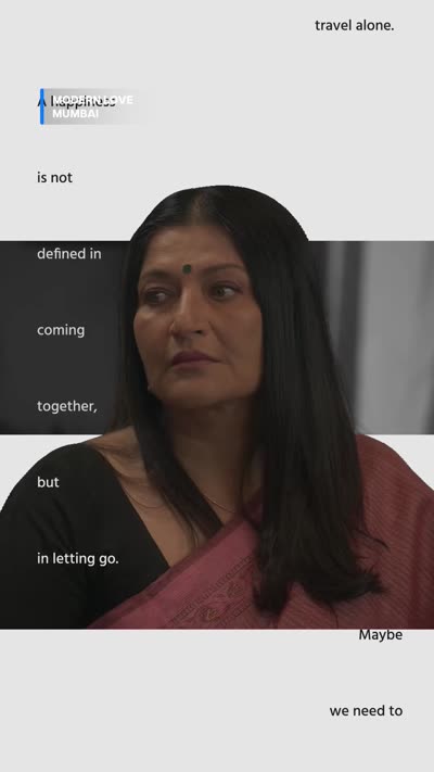
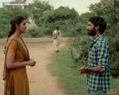
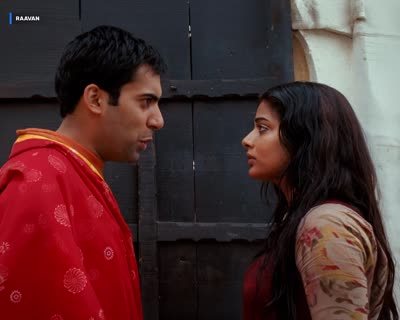
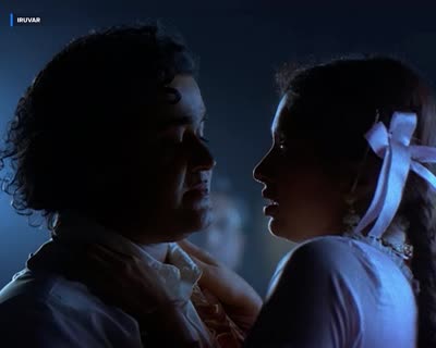
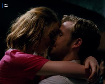
Two people facing each other in profile on a path, bug reading SITA RAMAM Two people facing each other in a doorway, a different title in the bug Two people facing each other at night, another title in the bug Two people facing each other in an embrace, bug reading LA LA LAND
  • Every cut matches the one before on composition and pose
  • Look across the four stills — same two-people-facing frame, four films
  • No subtitles at all; the theme is carried entirely by the matches
  • A dozen-plus titles, Indian and international, in twenty-five seconds
  • Bug names the right title on every single cut
Watch the cut →

Salman Khan — trend-led edit

4:5 · 0:35 · Trend-based edit
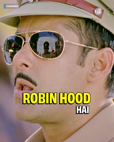
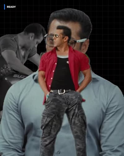
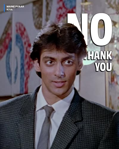
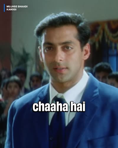
Caption reading 'hum yahan ROBIN HOOD HAI' with the name in yellow Subject cut out and composited on a black ground with a second clip behind Large white type reading NO THANK YOU set behind the subject Plain white caption reading 'chaaha hai' over a film frame
  • Built on a format that was already trending — speed to market is the point
  • Subjects cut out and composited onto black with panel splits
  • Type set behind the cut-out so the subject overlaps it
  • Sparse captions — most of the run has no text at all
  • Around nine titles, bug updating on every clip

⚠️ Trends age fast. Copy the technique, and check the format is still current before building a post on it.

Watch on Instagram →
More references land here as they ship. Got a cut worth adding? Send the link.